


Thought leadership | 03/11/2026
Needlepoint to Ledger Nano™: A Conversation with Susan Kare
Learn all about Ledger's collaboration with graphic design legend Susan Kare, who designed the badges for the Ledger Nano Gen5
Before You Dive In:
- Susan Kare is a graphic design legend who humanized the original Apple Macintosh interface with pixels, personality, and the Chicago typeface.
- For this exclusive collaboration, Kare designed the Ledger Nano Gen5 Badges: nine distinct icons letting you customize your device to match your vibe.
- Her philosophy treats digital design as a continuum of art history, tracing the lineage of pixel art back to 18th-century needlepoint.
- Susan Kare sat down with Ledger EVP of Marketing & Communications, Ariel Wengroff, to discuss moving beyond cold utility to stitch a little soul into the fabric of digital ownership.
Susan Kare is the rare exception to the rule that digital design history is written by code.
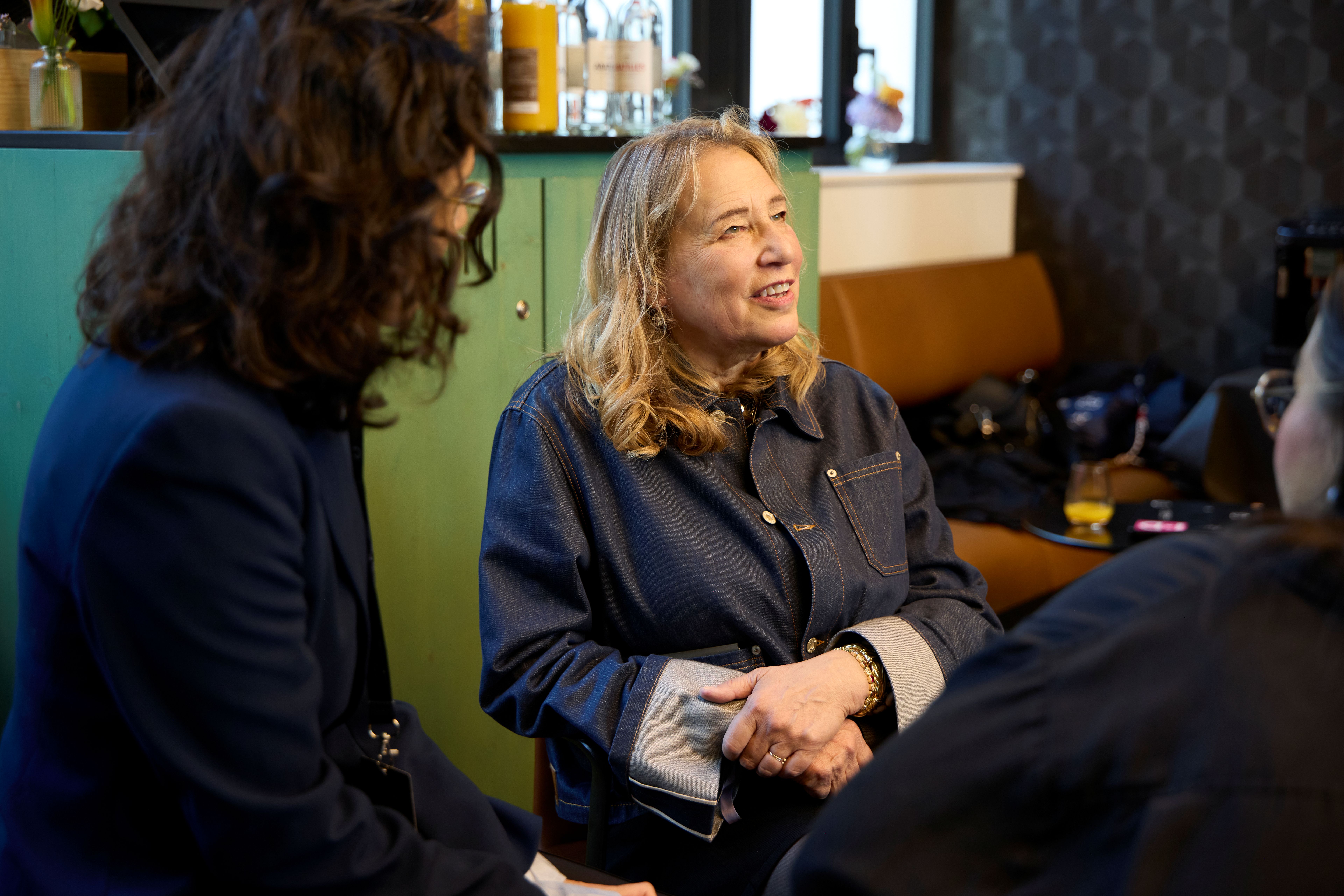
It’s not every day you get to sit down with the person who effectively gave the personal computer a smiling face. But at Ledger Op3n 2025, I had that exact privilege. We talked about the foundations of digital design, her impact on how we interact with screens, and why she was the only logical choice to design the collectible badges for the new Ledger Nano Gen5.
As we spoke, it became clear that Susan’s legacy goes far beyond icons or interfaces. It defines a lifelong pursuit of making complex technology feel instinctively human.
Susan Kare on The Birth of Digital Design
Design is core to modern computing, but getting there wasn’t a straight line. Today, we can’t imagine a UI without pixel art or intuitive typefaces, but Susan remembers the time before the grid.
Growing up, Susan was an “art kid.” She told me how she spent her childhood drawing animals, patterns, and fashion because her mother, having suffered from polio, couldn’t play sports with her. That context matters. It helped transform the Macintosh from a fortress of code into a canvas in her eyes.
When her high school friend Andy Herzfeld asked her to create graphics for a new computer he was working on, he bypassed complex algorithms entirely. He simply asked if she could “color in squares on graph paper.”
“It wasn’t that I was a computer science type person, but even I could get that whoa feeling,” she recalled of seeing the Mac for the first time. “It was visual, and that looked kind of interesting to me, even though I didn’t really have the breadth of knowledge to understand what a leap forward it was.”
That feeling was the entry point. She took the cold logic of the machine and gave it a pulse.
Inspiration from the Past, Influencing the Future
As we dug into her process, I realized Susan’s work endures because it is deeply rooted in history.
When I asked about the origins of her iconic bitmap style that defined the GUI aesthetic for a generation, she pointed directly to the 18th century.
“You study art history and realize there’s nothing new under the sun,” she told me. “To think digital art is a new thing no one’s done before… have you ever seen 18th-century needlepoint?”
She’s right. Long before screens, people were creating “pixel art” with thread, stitching distinct squares of color onto a grid to form complex images. Susan translated a centuries-old tradition of craft into a digital medium for Apple.
“I’m not saying that everyone should go look backwards,” she noted. “But I think it’s good to remind yourself that most things are a continuum and you can learn from that.”
The Philosophy of Timeless Design
This idea of a “continuum” forces a question: How do you create work that doesn’t just last, but becomes iconic? Susan’s answer is simple: Design the metaphor.
We discussed the floppy disk-inspired “Save” icon as a prime example of the trap designers fall into. To a teenager today, a floppy disk is a fossil. They know the icon means “save,” but they have no connection to the physical object. The hardware became obsolete, and the symbol lost its tether.
“It’s better, if possible, to represent printing or storage with a metaphor,” she explained. “If you do that, maybe something can have a longer life.”
This hits home for us at Ledger. Our devices are physical objects, yes, but they are metaphors for timeless concepts: security, sovereignty, and ownership. We’re building the modern metaphors for freedom.
Susan also reminds us that “timeless” implies risk. She noted that even the Coca-Cola logo could have been dismissed as “too feminine” or “hard to read” when it launched. Ultimately, a design becomes a classic only when it is attached to a revolutionary product.
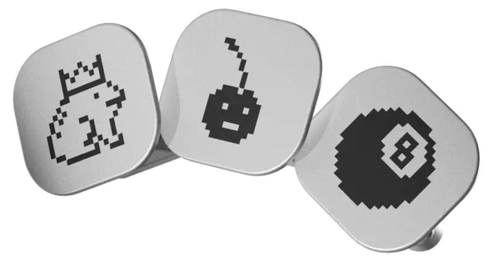
Kare’s Approach to Ledger Nano Gen5 Badges
This philosophy is exactly why we called Susan for the Ledger Nano Gen5. We wanted to move beyond security as a utility and allow users to express identity. But how do you capture the complexity of human personality in a tiny, monochromatic grid?
Susan’s approach was delightfully human. Collaborating with our creative team, she steered us toward “personalities” over literal representations. She drew a parallel to astrology: there are billions of unique people on earth, yet we have collectively agreed that 12 zodiac signs can represent us all.
“People like knowing,” she said. They like finding the symbol that says, this is me.
Iterating with the team to find that balance was a highlight. For Susan, the back-and-forth was “pure fun.” She emphasized how vital it is to have partners who are willing to jump into the creative unknown. “I like to surround myself with people who are open to jumping on these things… Everybody in the conversation had something to say that would make it better.”
When she saw the final designs lit up on the wall at Ledger Op3n, she was blown away. We took those icons and ran with them, turning digital shorthand into a physical expression of identity.
A Timeless Mindset
Toward the end of our conversation, Susan quoted a phrase I use often with my team: “Nothing starts with no.”
It was the perfect encapsulation of the project. Whether it’s creating the first fonts for the Macintosh or redefining how we secure digital assets, innovation requires a suspension of disbelief. It requires an environment where ideas can breathe before they get shot down.
This open, forward-thinking approach is core to Ledger’s DNA. As a company built on securing and redefining digital ownership, assuming positive intent is what allows great work to get put in motion.
Susan Kare’s perspective is a masterclass in design, and a perspective that understands lasting ideas exist on the continuum between change and the past.
Want to own a piece of this timeless design philosophy? Head to the Ledger shop to buy a Ledger Nano Gen5 signer and choose the badge that fits your personality.
Authored by Ariel Wengroff, EVP Marketing & Communications